Tuesday, July 30, 2013

Art research - Mass effect


Mass effect series was one of my favorite games i have played. It is science fiction themed with aliens and artificial intelligence. Therefore it is a great game to look into the designs for my project. I really like Mass effect's sleek futuristic designs. The armors look almost wearable and aesthetically they are very tidy. The cuts and lines of the costumes are very streamline and well balanced. Such as the last character sheet, the coat is very much like a blazer, which we have. But it have been reworked and altered to be fitting and part of the bodysuit. The shoulders have been added with armored details, with a simplified collar. All these elements creates a very "space-age" looking suit. Yet it is designed to fit our fashion taste, as it resembles to what we have as a tailored suit. So i should be looking at how i can alter what we consider as good fashion or aesthetically appealing into something different. At the same time familiar.


I am mainly looking for ideas and inspirations for details and how armors patch and pieces together. How armor joined bend with limbs so i can get some idea on how to make the cuts in the drawings. Mass effect had many armor designs, therefore it is a great resource for inspirations. Such as the 3D model sheets shown above. They show how the armor clips onto the body form and how where everything joins up. Where to add plating and how to fit the pieces together.
I noticed that there are very different types of armors that depends on what sort of look i am after. There are heavy armor with very thick and bulky plating. Which is designed to take alot of damage. Then there are medium armors and the last would be light armor which hint more ability to move and agility. All these ideas would be interesting and included into consideration when im designing for the three different factions of The Secret World, as each faction have a different moral that display as certain character about the members of the faction.  This would show through their uniforms, portraying what they represent.
I would be constantly looking back at Mass Effect's designs for ideas and inspirations as the series have a large range of armors and styles for both men and women. I also really like the art style of Mass effect, everything is very stylish and detailed. which fits the concept of the future perfectly.
Additionally, it is always helpful to look at how the professionals render the artworks, which would enable me to think of ways to improve my drawing and style.

Saturday, July 27, 2013

Illuminati drafts

I have done some rough drafts for the Illuminati faction uniform i was imagining from looking through art from The Secret World and Hitman. I have chose to stick to the dark color scheme of the Illuminati chose to play around with blue light accents to hint the futuristic feel. At this stage i'm just playing with shapes and forms to fit the bodies. I have illustrated two models, one female and one male to be the base for the out fit designs. While the model's appearances are not important, i do want to produce aesthetically interesting and finished illustrations worthy of final presentation also possibly portfolio material.  Therefore having a detailed facial depiction would make the drawings more appealing to look at. It will also help bring out a focal point for the viewers. Therefore i experimented with different hairs and makeup to suit. Because this is for the Illuminati faction i was thinking they would be dark and devious. So i was playing around with the cutting on the female outfit. Although the design is eye catching, it does not really qualify as "body armor". But i still had good practice changing around the designs.


This is the male draft im working on. I have roughly mapped out the panels and details. At this stage i am not too worried if the male and female versions reflects each other, i just want to draw and see what works the best on the bodies first.
Pose wise, as i noted before, i kept the postures simple and very much like fashion magazine poses. 

 I started cleaning up the image and started to develop the design of the male chest piece abit further to get a better idea on where to work on and add more details.

I was also thinking of make a draft of a potential head piece/helmet to go with the outfit. This may or may not be used in the final, but i would like to experiment and practice drawing the whole set.

Since the last picture i also made the background render lighter as it compliment the tones of the armor alot better.
 This is some of the experiments i tried with doing the full armor set. I have also tried insert a weapon to compliment the design. I do not think this would be used for the final, but it is good for me to try the options.


Similarly, i did the same for the female version. I played around with adding holographic armor to push the sci-fi tech theme. It definitely make the design more interesting, the blue hologram also acts as highlights, which give the design a good focal flow. as the blue from the arms to the belt and also the legs. It balances out the design. I am happy with the leg armor and boots, i wish to keep this bit of design. but i need to experiment more with the chest area. As i do eventually, with more visual research, i want the female version to look closer to the male version. For now i am content with the drafts.

Saturday, July 20, 2013

Gathering ideas for the Illuminati

The Illuminati in The Secret World are presented as dark, secret hands behind big corporations. Power and money hungry. Their base is in New York. Illuminati costumes are very suit and tie/corporate inspired, as in a way they are secret agents. their logo is a blue triangle, making most of their costumes blue, white and black themed.  Their outfits also have a very tactical armor look to them, with the combat boots, and chest armor. Very much like the FBI or the SWAT uniforms we are used to, but altered to a more futuristic look.

Even the Illuminati base architecture reflect the dark, technologically advanced aesthetics of the faction moral itself. They are described as forever young and hungry, and does not embrace traditions. And this shows through the faction's aesthetics. Very clean, very revolutionary with the designs. Therefore the over all feel of the corporation is very science fiction looking, and appear to be ahead of our time.
Color theme wise, the faction is almost clinical. Greys, blues, whites and blacks, are the basic color palette Illuminati costumes use, is again very corporal looking. 
I started looking at suit designs and movies that showcase this type of fashion, such as Men in black, In time, Constantine, Matrix. etc
One movie stood out to me was Hitman, which reminded me of the game of the same name.

The Illuminati faction showed many similarities, aesthetically wise and essence wise with those of Hitman, and this reminded me of concept arts for Hitman:
These are concept art for the game Hitman. They are quite inspiring as in a way it reflects what the Illuminatis are like, dark and secretive killer agents behind banks and business. In Hitman you play as an assassin, also clean and sharply dressed. This is very similar to the Illuminati faction. Therefore their outfits also echos the formal, cold, sharp dressed business attires.Illumiatis are described to be the opposite of the Templars, and they are against eachother head on. In a way Illuminatis are seen as a unti-hero sort of faction, ruthless and would do anything for a piece of useful information or money.
As for my project, like i mentioned before i was looking at mech-suits, to push the science fiction + fantasy concept even further, creating body armors that is a popular theme in Japan to compliment the Tokyo update that is coming soon.
Therefore by looking through the already existing Illuminati designs i visualized some form of a sci-fi tech, combat armor, utilizing the Illuminati colors. This would be the aesthetic i would work towards to.


Tuesday, July 16, 2013

Deux Human Revolution - Artist research: Jonathan Jacques-Belletete


Another artist I looked at for the combination of postmodern science fiction genre of The secret world was Jonathan Jacques-Belletete. These are concept designs for a game calle Deus ex Human evolution. It deals with the idea of cybernetic human enhancements and artificial intelligence, at the same time, combined with the fashion style that resembled a modernised renaissance period. This echos the Cyberpunk genre. I find his works very useful as in ways how to change and stylise the traditional clothing with futuristic hi-tech elements. Which I have experimented with some works I have been drawing for my project. 

I also like the richness of the rending, the colors are very solid and this is something i wish i can eventually work towards to skill wise. As at the moment i feel my technical skills are still a big problem for me.  

Sunday, July 14, 2013

Scene 2: Three way battle.

 This is the second illustration practice i tried and experimented with. This is the first time i have attempted a drawing with this many subject matters. I mapped out the basic shapes and positioning of the figures to start with. To make the rendering easier, i chose a warm toned gray as base, therefore its easier for me to determine the light and dark values for the drawing.
Once i was happy with basic main figures i wanted to add in a couple of background characters, as it is showing a 3 faction fight which is part of The Secret World. (Illuminati vs Templar vs Dragon).
Also the type of creatures featured in game, as the game deals with the concept of conspiracy theories, the creatures/monsters ranges from mystical to folk-lore horror stories. At this point in game, developers have released some hints for the up coming Tokyo update by putting flying dragons in areas. As a promotional teaser. Thus i want to use the dragons as the theme for this practice.
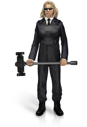
I also wanted to show a range of weapons and abilities available in game, therefore there is magic, high-tech weapons as well as traditional close combat weapons such as sword, hammer and even claws. This would give the viewer a feel for the game

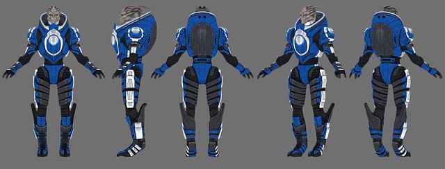
 I started to position more background figures into the composition, as i think this would add to the intensity of the scene. I chose to have the figures dressed in the current in-game faction uniforms to have them easily recognizable. As i mentioned before regarding the loading screens when entering a new area. At this point for the drawing, i not only wanted the battle to be mainly focused on the 3 factions but also the creature at the back, as these 3 factions compete each other for the kill of the "boss". I have started to add in background color, but made it invisible for now to get a clearer view of the positioning of the figures.


 This is what the background color is turning out to be. I think i have managed the color values better than i expected. With the background color, i can see the figure in the front with his back to us is currently looking too bright, as the main light source is in the direction he's facing, his back need to be darker.
Also proportion wise, he need to appear larger as he is the closest to the front. Which means i will have to make some alterations to his positioning, also pose as i need him to be pointing the pistol at the blonde. I will leave this adjustment till last, once i get the rest of the picture into perspective.

 Once i had enough drawing the rest of the picture, i moved my focus back onto the figure in the front. I reworked on his pose as best as i could, now it is much better as he appears to be targeting the blonde female. At the moment he is still need to appear larger to give the illustration more depth. And as mentioned before, with his back towards the viewer, the tones need to be darker.
This is the final outcome. I have adjusted the front figure more, darkened the tones and to my surprise it did improve the picture perspective alot more. I have in the end added another small background figure to face the boss to hint the idea of player vs player vs boss. I also played around with the dragon's fire to make it look more intense.
Overall i am content with this piece. This is the furthest i have ever tried to push myself with an illustration and for the time frame i tried to squeeze this work into i have tried my best at getting it as best as i could do at the moment. I do feel like because i forced myself into doing something harder than usual, it made me practice and tried techniques that i have never attempted before, with interesting positive results. This was a very good exercise for me and i feel that by doing this i taught myself more about colors and light values.
I also feel that it has enabled me to draw faster as well, as i learnt some new methods. 

The next step i will progress towards is the 3 sets of uniforms for the 3 factions, as the costumes are the main contents for this project.

Thursday, July 11, 2013

Dishornored - Artist research: Viktor Antonov


So for me I began to look at artists for other games that shares the similar essence of The Secret world. I came across a game called Dishonered and its lead artist Viktor Antonov. His paintly style reminded me of the Secret world artist Askim's works. The brush strokes have a classical painting essence that carries the notion of the traditional old world feel that Dishornored and The secret world have. The composition of the artworks also resembled formal classical portraits, yet they have a stylised aesthetic that's signature to Antonov, his digital artworks almost have a traditional oil painting style, that is very suited to these portrait concepts he have done. Which is one of my own personal goal, and that is to develop a drawing style that can be recognisable as my own.

Tuesday, July 9, 2013

Remember Me concept art by Gary (Jamga)


I was looking at concept artworks for the a science fiction themed game- Remember me by Capcom.
The concept arts are by an artist i found on the online gallery Deviantart, username Jamga.
I looked at the costume designs in particular to help me with my own project. As i mentioned before  i was looking for inspirations for futuristic fashion designs for my project to echo the popular concept of hi-tech driven culture of Japan for the upcoming in-game Tokyo update for The Secret World. 

I am interested in how these designs' straight cuttings, the asymmetrical shapes and color blocking of the designs. I like how the artist altered modern suits with panels and accents to hint the other worldly futuristic feel for the outfits. It provides a very familiar aesthetic as it is based on fashion designs we already have, which make the clothing look very believable and wearable. 

The presentation is also helpful for me as well, similar as artist examples i have seen before there is a slight gradient for the background. These are from light to dark. It is a very faint transition, but it still make the layout look more complete, more finished. Also it is useful to see how to pose the figures to model the fashions, for men and women. The poses are very similar to what you would see in a magazine or catwalk even. Which would be similar to my fashion illustration projects i have done previously. Therefore in a way, posing the figures are very similar to fashion illustrations and shoots. Such as illustrations like this one:


Gary (Jamga)'s designs raises a question for myself about how would i design a costume, to make the outfit echo each faction's essence for both men and female at the same time reflect elements of sci-fi. 
In The Secret World, the players choose among 3 factions to play as. Illuminati, Templar and Dragon. I need to construct designs that not only echo the faction's feel, but also "futurise" the aesthetics. I think i will start by creating another scene illustration depicting all 3 factions in their current available costume to get more confident with digital painting and generate some ideas through doing. 


Sunday, July 7, 2013

Scene 1: Point blank range


This is the first scene illustration i practiced drawing. I have loosely based the likeness of the figures on my own and my friend's characters in The Secret World. Not for a particular reason, as this is for practice and experiment. I am rather happy with how it turned out in the end, as i lack the experience in drawing more than one subject matter at a time. As i mentioned before speed was, and  is still kind of is a problem for me when constructing a complete work. Because i want to use this project as an opportunity to practice and produce works that might end up or help me produce works worthy of being portfolio material eventually. At the moment i am not overly confident with my works, therefore i wish to try and do something i'm not usually comfortable with.

This work did took me slightly longer than i wanted or planed to. However i wanted to go through with the practice to force myself to get it as complete as i can as fast as i can. Over all i think this is decent. I can spot a few mistakes myself such as the lighting from the magic on the right side not really affecting the female character, or the male character holding her at gun point. What is also something i need to improve on is the the flow for the eyes and focal point/s. As in this picture i think because all characters are in the same amount of focus and details, its hard to find a main point to focus on, therefore it looses alot of depth, making the work less interesting.

Speed wise, i did average, because of the lack of practice, i find myself working and reworking on one small area for unnecessarily long period of time. This is something i would like to get pass eventually, with enough practice and experiments. For my next picture i plan to make the work bigger and more subject matters to push myself even further. Also more more colors. I would like to see how i would do, and hopefully make advances technically.

Saturday, July 6, 2013

Artist Jonas De Ro

https://www.facebook.com/jonas.dero?hc_location=stream

Today i started to follow concept artist Jonas De Ro on facebook as he constantly upload work progresses and news on what inspires him and what new works he has been working on.
I am again looking at the relationship between light and color.The work above is very narrative, and appear to be a section of a comic with the texts. The main light source is from the sun in the background, therefore everything infront would appear saturated and in a consistent tone of warm tones, in relation to the tone of the yellow sun.
As i look at more works by De Ro, i begin to notice something i need to be aware of. As shown in the work above, the light source is natural, and from 1 single point - the sun.
In the next piece:

There are multiple light sources. The obvious one being the sunset in the back ground, however there are also other light sources such as the illumination from the blue "superpowers" of the figures and weapons. Therefore the figures show lighting depending on the light sources they are most effected by. Therefore everything look in part of the scene as a whole. 
I also find it very helpful to see his progress in composing his works. Such as the work in progress screenshots he took above.
He started the composition by shading in figures and shapes in general in grey scale, this is a good technique i see alot of artists do, as it is easier to grasp light and dark tones in gray scale. Also shapes and forms are more easily defined in grey scale, to make composing the draft quicker and more accurate. Therefore it's easier to determine colors and shades working this way.

I also noticed that as subjects are further back are far more saturated than the main figure in the very front to create depth. I really like the blue accents of the superficial un-natural lights, it almost in a way creates a flow for the viewer's eyes. It is also keep the illustration layout very consistent  and well balanced, making each figure stand out, yet work well together.
It is very easy to see while studying artist works, but much more difficult to actually achieve for my own work without actually practicing.


The current work i am working on, as shown in my previous entry only consists of 3 characters. I would like to work towards a scene with more subjects and more complex background such as the work by De Ro above.


Friday, July 5, 2013

More research on illustrating a scene 2

Similar to my last research, i am looking for ways to create that relationship of tones and shades of color. What interested me here is the figure in this illustration which is in a red hooded cape. The rest of the piece is a green shade and the red cape adds a interesting focal point for the viewer.The flash of red give the illustration more life.

For my own project i have contacted The Secret World developers for tips. They have gave me very useful advice " In general mid values should shift slightly more saturated. This will breath much more life into your colors." - Lead developer (username: Tilty)
This is very interesting and useful point, and from looking at videos such as the one above i got a sense of what Tilty was referring to. This is helpful to create more flow for the eyes which is important in creating successful illustrations.
Ofcause i am still focused on improving my technical skill at the moment, color and light is the main elements i need to practice to understand.

Thursday, July 4, 2013

More research on illustrating a scene

This is a video I want to save for my research. As i am now practicing with a complete illustration. I find it very useful that i get to see how this particular artists start a piece of work, which is simple outlines on a white canvas, then adding a gray background to provide the base color for the piece. I am already doing these techniques. Also i noticed that i do not need to make all the areas too smooth through blending, which was my common mistake. It takes away defined details to make the illustration more three dimensional and looses its depth. Therefore some lighted areas are best kept sharper than smoothly blended out. Also what interest me in this video is the tonal relationships between the surroundings and the subjects. Tones are kept in sync to each other so everything look in place, the main light source is behind the subjects therefore they appear darker than the background. This is something i need to keep in mind with, as lighting is a very important concept only through practice i can grasp.

Digital art painting skills practice for games.

As i continued to draw i noticed that for me to improve i need to push myself to do large works, and more complicated compositions. I have been looking at artworks for games, and i noticed that not only there are works that are purely for the sake of design purposes, but also illustrations that depict a 'scene' like scenario that provide the viewer a feel for the game. 


These artworks for games (APB reloaded, Saints Row 3 and Perfect world Online), are composed in a narrative format almost like a still from a piece of moving image. They are mostly used for promotional purposes for games to give advertise the genre and the essence of the game. Alot of online games also use these illustrations for loading screens, as entering different areas in the game would require a loading time, during the wait time, developers would use a illustrated image for the players to have something interesting to look at while waiting for the game to render the new area.

For me however, to paint a scene like illustration would be excellent to push and develop my drawing ability. As i not only want to create concept arts, i do want this to be an opportunity to practice and improve my technical skills. It would also force myself to not dwell on the level i am currently on, which is illustrating 1 single figure at a stationary state/pose. As in a scene, camera angle, movement, lighting would all be considered. I have previously practiced in older works i made outside of the current uni project, such as these:


These are drawings i made in tribute to the game title - Mass effect, where i tried to illustrate a scene, elements of movement, multiple figures in mid actions and more complex foreground and background relationships. I found these type of works more challenging and drive me to improve and learn. As without a solid foundation of skills, i would not achieve what i would eventually wish for career wise, to be a game artist. Therefore along concept designs i would like to create a couple of illustrations in a more narrative format.

To conclude this entry, i have started on an illustration, this is a screenshot:

some layers i have made invisible as i am focusing on working on 1 figure. There are 3 figures in total in this piece im working on, i want to practice on experimenting with light and dark, and ofcause my drawing speed, which at the moment is a huge issue. I find it difficult to amp up my work rate, which is not ideal as a game concept artist. I need to be more efficient with my working speed, and this is what these illustration practices will help me to improve on, as well as the technical skills.

Tuesday, July 2, 2013

Character concept art layout research.

As mentioned before i was testing out how i should compose my page to lay the figure i drew onto for presentation purposes. I started study and collecting concept art illustrations to see how digital artists render their background to compliment and contribute to their designs.


These works are from a digital art student - Andrew Ryan. He have made these fanmade mock-concept illustrations in tribute to his favorite games Mass effect and Dragon Age. Therefore it is very similar to what i am doing for my own project as i am creating mock-concept for The Secret World.
From looking at his works, i feel like i am on the right track layout wise. The gradient of grey fading to white is aesthetically more interesting, also it creates a nice contrast for the figure's faces, making the faces a focal point. What i also like is the "surface" he created to place his characters on, most likely by duplicating the main layer and flipping it vertically in creating the reflection. It make the figures appear grounded and not floating, providing a more complete, more solid work.

Similarly, this is an concept art i collected from online gallery/portfolio website - Deviantart, by an user called Mikkuru. Mikkuru also have done a similar gradient from dark to light to create a contrast for the figure. For the ground the artist merely shaded in shadows to give the appearance of ground surface. Therefore i have a couple of option on how to compose my concept background, which i can experiment with to see which work and look the best.

Other concept arts also show the gradient flipped around, with the lighter shade on top and fade to a darker bottom:

This is a concept illustration for an unreleased title - Destiny by Bungie. Because the facial area is covered by helmets, i think it works better having the lower part of the background darker than the top. Therefore there is no real fixed rule on what is the right way up, but having a rendered background do complete the illustration, which is what i want for my final presentation. I want my works to be viewed as artworks and not just for design purposes.